
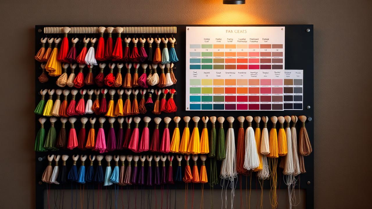
Match against a physical chart
Convert brand hex or Pantone values to the nearest thread number in your supplier's chart, then confirm on a real card under the light the garment will be seen in. Two threads that look identical on screen can differ noticeably in sheen.
Fewer stops, better result
Every colour change is a trim, a jump and a chance for misregistration. Gradients and near-identical shades should collapse into one thread. Most logos read perfectly at three to five colours once translated to stitches.
- Collapse shades within roughly 10% lightness of each other.
- Replace gradients with a single solid or a stitch-direction change.
- Reserve metallic thread for accents — it runs slower and breaks more.
Contrast beats accuracy on dark garments
On black or navy, an exactly matched dark brand colour disappears. Lift the value a step, or add a fine outline in a lighter thread. The logo will read as correct even though the thread number is not the literal match.